
If you’re an eCommerce store owner who uses PPC as a key part of their strategy, you’ll probably agree that setting up and running a successful Google Ads campaign is no easy feat.
Why do I say so? Well, there’s so much work to be done (researching keywords, writing ad copy, etc) with your ad campaigns, and you can easily burn hours on optimizing a single campaign. Given that you have to manage the other areas of your business (sales, operation, customer service…), taking care of all these things and staying on top of your campaigns at the same time feels downright impossible.
Well, here’s some good news: in a bid to make our lives easier, Google has recently rolled out Responsive Display Ads as the default ad type for their Display Network. With these ads, you’ll get to tap into a larger ad inventory without burning your time on coming up with new variations of your ads. Read on to find out more!
What are Google Responsive Display Ads?
Google bills their Responsive Display Ads as asset-based ads which “automatically adjust their size, appearance, and format to fit available ad spaces”.

All you need to do is upload your assets (logos, headlines, images, descriptions, etc), and Google will automatically generate your ad as ad spaces become available. Responsive display ads can show as almost any size text, image, or native format, and Google will strive to optimise its assets used to achieve the best results for you.
Google Responsive Display Ads vs Google Responsive Ads
Before we delve into the benefits and best practices of Responsive Display Ads, let’s take some time to discuss how these ads have evolved over the past few years.

Before Responsive Display Ads came Responsive Ads; these were first launched in 2016. Similar to Responsive Display Ads, Responsive Ads were promoted as having the ability to “automatically adjust their size, appearance, and format to fit just about any available ad space.”
So, what’s the difference between Responsive Display Ads and Responsive Ads? Well, with the older Responsive Ads, advertisers could only upload 2 headlines, 1 image, 1 logo, and 1 description. The new Responsive Display Ads, however, allow advertisers to play around with more assets (5 headlines, 15 images, 5 logos, and 5 descriptions).
In case you’re wondering, yes, increasing your number of assets does have a direct impact on your campaign performance. Google has stated that using multiple headlines, descriptions, and images results in an average of 10% more conversions at a similar CPA, so you can expect to see a rise in conversions once you incorporate more assets into your Responsive Display Ads.
The best part? Even though advertisers can achieve more ad permutations and combinations with Responsive Display Ads, we don’t have to spend more time A/B testing our ad combinations. Google actually uses Machine Learning algorithms to decide the optimal combination of assets for each ad slot based on predictions from your performance history, so you can leave that to them.
The bottom line? Just upload your assets, and Google will take care of the rest!
Benefits of Google Responsive Display Ads
Google Responsive Display Ads bring about a whole host of benefits. They help you save time and give you greater access to the Google Display Network (GDN), and you can even use them to support any dynamic remarketing campaigns that you’ve got set up.
1. Saves time
The first benefit of using Google Responsive Display Ads is that it saves you a phenomenal amount of time. We’ve just discussed this; since Google is effectively automating all your A/B testing efforts, this drastically cuts down on the time you need to manage and optimise your Google Ad campaigns.
2. Greater access to the GDN
Here’s the thing: there are almost 20 standard sizes for banner ad units on the GDN. Assuming you’re running a small business, and you don’t have an in-house designer on your team, it’ll be challenging to come up with 20 different variants of your ad, and make sure that each variant looks presentable.

Because they don’t have much time on their hands, most advertisers end up honing in on the 5 most popular banner sizes, and they create ads exclusively for these sizes. This means that these advertisers don’t experiment with other ad slots, and this causes a ton of wasted inventory on the GDN.
With Google Responsive Display Ads, however, this will be a thing of the past. Since Google automatically adjusts your ad’s size, appearance, and format to fit any available ad space, this means that you’ll be able to serve your ads on a wider inventory of sites without putting in any additional work.
The way I see it, this makes a lot of sense. Google gets to cut down on wasted inventory, and advertisers (like you and me) get to enjoy greater reach and more conversion opportunities. Talk about a win-win!
3. Support dynamic remarketing campaigns
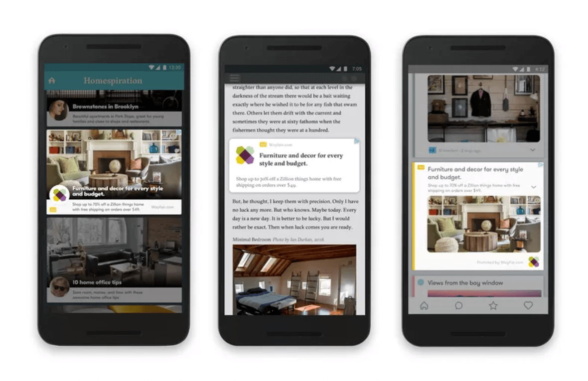
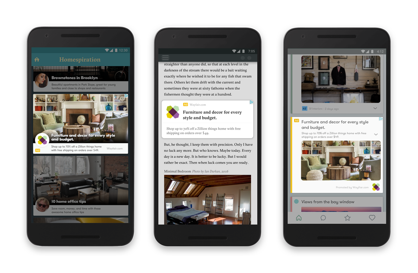
Dynamic remarketing campaigns are already more effective than standard Display campaigns, simply because you get to personalize the content that you’re showing to each consumer. To supercharge your dynamic remarketing campaigns, and make them even more powerful, go ahead and use them in conjunction with Responsive Display Ads.
How does this work? First and foremost, you’ll have to create a product feed or add an existing feed to your campaign. Once this is done, your Responsive Display Ads will automatically start showing personalized content to your consumers; as always, Google will adjust the size and appearance of these ads to fit into whatever ad spaces are available.
To learn more about creating a feed and supporting your dynamic remarketing campaigns with Responsive Display Ads, read this Google guide.
How to create Google Responsive Display Ads
Creating a Responsive Display Ad is easy. Simply upload your assets, and Google will automatically generate ads to use on the GDN.
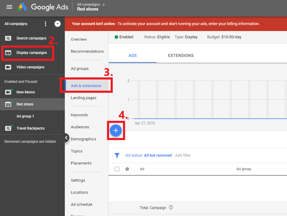
Step 1: Sign into your Google Ads account.
Step 2: Using the navigation panel on the left, click on “Display campaigns”.
Step 3: Click on “Ads & extensions” from the page menu.
Step 4: Click on the blue “+” button.
Step 5: Click on “Responsive display ad”.
Step 6: Select the ad group that you want to create your ad in. (Note: If you want your Responsive Display Ads to support dynamic remarketing, your selected ad group or campaign has to be attached to a feed).
Step 7: Add and save your images. You can upload up to 15 marketing images and 5 logos. Try to max out your quota; this makes it easier for Google to optimise your ads.
Step 8: Fill in your headlines, descriptions, and business name.
Step 9: Preview the most popular sizes and ad formats of your potential ads, and make sure nothing looks wonky or strange.
Step 10: Click on “Save”.
You’ll probably be excited to check out how your Google Responsive Display Ads are performing - but you should wait for at least a week before you review your results. Before that, you’ll have insufficient data, which might paint an inaccurate picture.
What if you want to have more control over the look and feel of your Display ads? If that’s the case, Google also allows you to build and upload your own image ads. You may create your ads externally (in Google Web Designer, for example), and upload them as a .zip file to your Google Ads dashboard.
If you’re wondering which option is preferable, for starters, I’d recommend just letting Google do the heavy lifting. Focus on analyzing your campaign, and learn what works and what doesn’t. Once you have that knowledge, then create your own ads if you wish.
Google Responsive Ads Image Sizes
For those of you who are creating your own ads, here’s a complete list of Google’s supported ad sizes.
If you’re simply uploading your assets and letting Google work its magic, your life will be much easier. Google states that the top five ad sizes can be automatically resized to fit 95% of the available placements across three million apps and websites - so just create assets to fit those five ad sizes, and you’re good to go.
300 x 250 (Medium rectangle; performs well when embedded within text or at the end of articles.)
728 x 90 (Leaderboard; performs well if placed above main content, and on forum sites.)
160 x 600 (Wide skyscraper; performs well when used along website sidebars.)
320 x 50 (Mobile leaderboard; performs well in the context of smartphone ads, especially when used at the bottom of a page.)
300 x 600 (Half page; suits brand advertisers which want to go for more visually impactful ad sizes)
How to craft your Google Responsive Display Ads
Now that you know how to create your very first Google Responsive Display Ad, let’s discuss the best practices that will help you get maximum mileage out of your ads.
Ad Information
Your ad information consists of:
Short headlines (between 1 to 5 headlines, 30 characters or fewer). This headline is the first line of your ad, and it appears in tight ad spaces where the long headline doesn't fit. Short headlines may appear with or without your description.
A long headline (90 characters or fewer). This appears in place of your short headline in larger ads. Like short headlines, long headlines may appear with or without your description. Do note that a long headline may not be displayed in its entirety; if shortened, it will end with ellipses.
Descriptions (between 1 to 5 descriptions, up to 90 characters). This adds to the headline, and invites consumers to take action. The length of the rendered description will depend on the site that your ad appears on. If your description is shortened, it will end with ellipses.
A business name. This is the name of your business or brand.
A final URL. This is where consumers are redirected to when they click on your ad.
Optional components include:
Adding tracking or custom parameters to your URL.
Including Call to Action (CTA) text on your ad.
Adding promotion text (eg. “Free 24-hour shipping”) to your ad.
Google Responsive Display Ads: Best Practices for Ad Information
Best practices here include:
Maxing out your quota for both your headlines and descriptions
Front-loading your messaging for long headlines and descriptions, and
Including CTAs on your headlines if possible
Let’s explore these individually, starting out with: Maxing out your quota for both your headlines and descriptions.

While you can get away with inputting only one short headline and one description, the most effective thing to do here is max out your quota, and provide Google with 5 headlines and 5 descriptions. Like I’ve mentioned previously, Google has stated that advertisers see 10% more conversions at a similar CPA when using multiple headlines, descriptions, and images with responsive display ads. When it comes to your ad information, more is definitely more!
Next, let’s move on to front-loading your messaging for long headlines and descriptions. As you can see in the Ad Information section, both your long headlines and descriptions may get truncated if they are too long to fit into a specific ad space. Bearing this in mind, you should always front-load your messaging for these two elements; this way, you can ensure that your users don’t miss out on any crucial information.
Here’s a positive example:
Long headline = Flash Sale - Up To 90% Off For 24H. Don't Wait, Stock Up On Towels & Bedsheets Now!
When truncated to 50 chars = Flash Sale - Up To 90% Off For 24H. Don't Wait, St…
And a negative example:
Long headline = Need To Stock Up On Towels & Bedsheets? Shop Our Flash Sale - Up To 90% Off For 24H.
When truncated to 50 chars = Need To Stock Up On Towels & Bedsheets? Shop Our F...
With the first ad, yes, your text is cut off, but you’re still getting your message across. With the second ad, however, your consumers won’t even realize that you’re having a sale.
Last but not least, you should also include CTAs on your headlines if possible. Why is this the case? Well, your headline might show without your description, which means that you should try and craft your headlines to be as all-encompassing as possible. Ideally, your headline should be able to stand on its own, and entice consumers to click through (even if your description isn’t displayed below).
Here’s a positive example:
Long headline = 24H Flash Sale, Up To 90% Off. Don't Wait, Stock Up On Your Hypoallergenic Towels Now!
Description = Hypoallergenic & Suitable For Sensitive Skin. Rated 5 Stars By 15,000+ Folks & Counting.
Even if the description gets omitted, this headline can stand on its own. It mentions the product (hypoallergenic towels), highlights the current promotion, and encourages consumers to click through with a CTA.
And a negative example:
Long headline = The Best Hypoallergenic Towels, Suitable For Sensitive Skin. Easy To Wash, Dries Fast.
Description = Flash Sale - Up To 90% Off For 24H. Don't Wait, Stock Up On Towels & Bedsheets Now!
If we do away with the description here, the headline isn’t quite as impactful. While it does convey the product’s benefits, it doesn’t showcase the promotion or end with a CTA.
Images
Where image assets are concerned, Google allows advertisers to upload up to 15 marketing images (in landscape and square formats) and 5 logos. Again, try and exhaust the quota here - the more image assets you have, the easier it is for Google to create aesthetically appealing Responsive Display Ads that will get you more clicks and conversions.

Here are the specific requirements for each type of image:
Landscape: Landscape images should have a ratio of 1.91:1 and be greater than 600 x 314. The file size limit is 5MB.
Square: Square images should be greater than 300 x 300. The file size limit is 5MB.
As a general rule of thumb, you should also avoid using images which are laden with text. At the very maximum, text overlays should take up 20% of image space. Do note that your image may be cropped horizontally (up to 5% on each side) in order to fit into certain ad spaces.
Google Responsive Display Ads: Best Practices for Images
Best practices here include:
Choosing images that don’t look “stock”
Choosing images that look good when they’re scaled down
First, let’s talk about using images that don’t look “stock”.
Now, it makes sense that you’d be concerned with using high-quality, professional-looking images that reflect well on your brain. But this doesn’t mean you have to settle for generic, uninspiring stock photos.
For example, say you’re running an ad to promote your digital marketing agency.
Here are the sorts of images that you shouldn’t use:

This picture is so cheesy, it kind of hurts me to look at it. (If you’ve bought any other stock pictures of employees huddled together, clapping, or shaking hands, those all fall into the same category as well.) I think of these pictures as “cop-outs”; they could portray your business in a somewhat relevant way, but they’re way too generic, and you’ll only hurt your conversions if you feature these pictures in your ads.
Be honest with yourself: if you saw this picture on a website, would you pause to read the accompanying text? I don’t think so. You’ll probably skip past to the rest of the website without the ad registering on your radar; in the unlikely event that you DO see the ad, you might assume that the ad is promoting some team building program or business course, and scroll past it in a second.
Ready for the next image? Here goes…

Now, at first glance, this image looks like it ticks all the boxes.
It’s relevant to the ad you want to run.
It’s well-composed and of great quality (gotta love a bokeh shot).
It features an attractive woman, which can’t hurt.
But here’s my gripe: again, it’s way too generic and “corporate”, and it doesn’t stand out or entice website visitors in any way.
So, what type of pictures should you be using instead? Simple - anything that’s unexpected.

Take this image of a woman grinning at you from behind her desk, for example. This is also a stock image, but it looks so much less “stock” than that other image of the blonde woman that we just discussed above.
Yes, the picture is obviously posed, not candid - there’s no denying that. That said, it isn’t one of those pictures that you’ve seen a gazillion times (on banner ads, promotional flyers, and standees at events); in fact, the image sort of gives you the sense that you’re peeking into a real person’s workplace.
All in all, utilizing an “unexpected” image such as this one will help you draw the attention of more consumers, and potentially build a connection with them (regardless of how small it may be). If you’re wondering how you get stock images that don’t look “stock”, there are plenty of image repositories that you can tap on. Two of our favourites are Unsplash and Pixabay.
Alright, let’s move on to our next tip, which is choosing images that look good when they’re scaled down. Remember: your image might look pretty big on your screen (when you’re uploading it to use on your Google Ads!), but it’ll be a lot smaller when it’s displayed on a 300 x 250 ad.
Say you want to create Responsive Display Ads for your yoga studio, for instance, and you’re trying to choose between these two images:

And…

Which do you think is the better choice?
If you answered the second image, you’ve nailed it! The first image is more awe-inspiring and aesthetically pleasing, but when you resize both pictures to fit within a smaller ad, you can barely see the woman in the first image, let alone tell that she’s doing yoga...

On a semi-related note: assuming that your yoga studio doesn’t organise any yoga retreats or outdoor yoga classes, it also makes more sense to use a picture that features someone doing yoga indoors. You don’t want to mislead your potential customers!
Logos
Logos are an optional component of Google Responsive Display Ads. That said, adding a logo asset (or multiple logo assets) will increase the number of placements you’ll be eligible for, so I definitely recommend uploading logos together with your other images.
Here are Google’s guidelines for logos on Responsive Display Ads:
The recommended size for logos is 1200 x 1200, but these should be 128 x 128 at the very least.
For more accurate rendering, upload a landscape (4:1) logo which is 1200 x 300 (or 512 x 128 at the very least).
Google favours logos with transparent backgrounds, and the file size limit for each logo is 5MB.
Best Practices for Logos
With your logos, there’s just one best practice to keep in mind: be open to adjusting or reworking your logo, instead of simply scaling it up or down to it Google’s sizing requirements. You might need to use only the icon portion of your logo, or shift the alignment of your logo in order to come away with a design that works.
If you need visualizing this, here’s a great example by WordStream, which uses the Spotify logo to highlight the shortcomings of simply scaling your logo up or down…

As you can see, the above Spotify logo utilizes a landscape format, and there’s no way to crop it into a square logo:

Here, the obvious thing to do is to get your designer to come up with a square version of the logo. One of the easiest solutions is to simply add whitespace to the top and bottom of the image, so that it becomes a square:

This logo looks fine in the editor, but again, it might be a little hard to read on smaller ad formats. Bearing this in mind, your best option is to modify your logo in a way that allows it to be displayed in a 1:1 ratio, without compromising on clarity or legibility.
Spotify actually has another version of their logo, with the word “Spotify” positioned directly under their icon, so that would work:

If they want their logo to be even clearer, they could also omit their brand name completely, and simply feature the logo by itself:

Now, after scaling the three logos down to the same size, you can see how this makes a WORLD of difference. The second and third logo are a ton easier to see and read, as compared to the first one:

Responsive Ads Best Practices: General Tips
To round off our guide, here are a couple more responsive ads best practices that you can apply to increase the effectiveness of your ads.
Message match
Messaging matching deals with making sure that the message on your landing page matches the message in your ad, and this is something that you should do for all your PPC campaigns. In the context of Google Responsive Display Ads, though, it’s a teeny bit tricky to make sure your message matches up 100%, simply because you can’t tell which of your headlines or descriptions Google will include in which ad.

To counter this, make sure that your messaging on your Responsive Display Ads are as consistent as possible. For example, your short and long headline should convey the same point (though you’ll be able to elaborate on this point in greater detail with your long headline). Because your short and long headline will never appear on an ad at the same time, you don’t need to worry about being repetitive.
Here’s a positive example:
Long headline = Flash Sale - Up To 90% Off For 24H. Don't Wait, Stock Up On Towels Now!
Short headline (V1) = 90% Off On Towels - 24H Only.
Short headline (V2) = 24H Sale! 90% Off On Towels.
Short headline (V3) = 24H Sale: Towels @ 90% Off
With this ad, you know exactly what your landing page headline should reference. It should talk about your 24 hour sale, and the fact that towels are now 90% off.
And a negative example:
Long headline = Flash Sale - Up To 90% Off For 24H. Don't Wait, Stock Up On Towels & Bedsheets Now!
Short headline (V1) = 90% Off On Towels & Bedsheets
Short headline (V2) = Get New Towels: Now $5 Apiece
Short headline (V3) = Stock Up On Bedsheets: $20 Only
With this ad, it’s hard to tell what your landing page headline should say. You can’t use a specific headline, eg “Shop Discounted Bedsheets At $20 Only”, because that’ll distract all your consumers who clicked through on your ads about towels. In this case, you’ll have to settle for a generic headline such as “Shop Discounted Towels & Bedsheets”, and this may very well hurt your conversion rates.
This begs the question: what if you want to test out multiple offers and/or Calls To Action? Simple -- just create separate ads to test those out. Have a standalone ad to promote your discounted bedsheets, and another one to promote your towels. This way, you’ll be able to benchmark the performance of both ads and identify which offer is more attractive, plus look at the variants of each ad to figure out what type of wording/phrasing works best.
Optimise each asset
Theoretically, Google Responsive Display Ads could be a set-it-and-forget-it type thing. After all, Google will use their algorithms to automatically determine the best asset to use with each ad that it serves to your consumers.
That said, you can still do your part to increase the success of your ads and campaigns. By regularly optimising your assets and uploading new assets to try out, for example, you’ll ensure that Google gets to pick from only the best of the best. This will increase both your click throughs and conversions.

To do this, click on “Ads & extensions” in your left-hand panel, and then select “View asset details”. Here, you’ll be able to see a full list of your assets (headline, description, images, logos, etc), plus the rating that Google has conferred upon it. For assets which are rated “Low”, swap them out with new assets, so that you eventually build an arsenal of high-performing assets that Google can use to create a kickass ad.
Conclusion
Alright, that’s all I have for you on the topic of Google Responsive Display Ads. The way I see it, Google is trying to lower the “barrier of entry” to Google Ads, and make the platform more accessible. For all the Google advertisers out there, that’s a great thing!
Have you tried out Google Responsive Display Ads? Did these do better than your standard campaigns? Leave a comment and let us know.